This post will overview the ‘Red Dot Talk’ portion of our Finance 101 video series. To view the entire series, click here to see our ‘Finance 101’ page.

All of our clients have heard this talk and many of them have heard it several times.
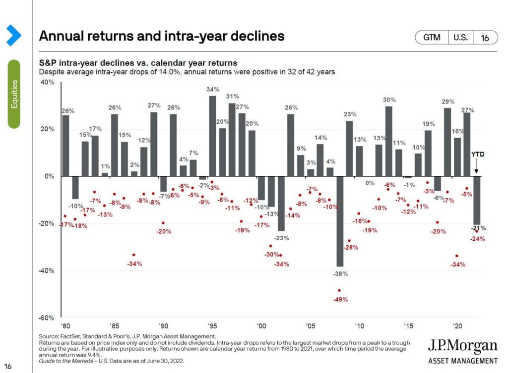
This chart is from the JP Morgan Guide to the Markets and we’re going to pull two lessons from it.
The first thing on this chart is the bars and what they represent is what the S&P 500 did each year. You’ll see that these bars are all over the place and there is no pattern.
We need to agree on the fact that nobody knows what the next bar is going to be. If you look at longer periods of time – rolling 3 year, 5 year, 10 year periods – your odds of success increase tremendously.
The second thing on this chart is the red dots.
What are these red dots? They are the low point of the S&P 500 every year. You’ll see that they are ugly and they are negative every year. If you average the red dots they are close to -15% so on an average year you can expect to be down 15% and sometimes much worse.
What do we do on a red dot? We’ve got to agree upfront that the smart thing to do is to rebalance, to add money to equities.
The last thing you want to do is to sell on a red dot. Never sell on a red dot.
If you’d like to discuss your situation, schedule a meeting with our team here.
If you’d like to sign-up for our monthly newsletter with four high-quality, financial planning focused posts per month, click here.
Disclosure: Opinions expressed in the attached article are those of the author and are not necessarily those of Raymond James. All opinions are as of this date and are subject to change without notice. Keep in mind that there is no assurance that any strategy will ultimately be successful or profitable nor protect against a loss. The S&P 500 is comprised of approximately 500 widely held stocks that is generally considered representative of the U.S. stock market. It is unmanaged and cannot be invested into directly. Past performance is no guarantee of future results.


